Please always enter the name of the template and the Joomla version and the live URL if available
[SOLVEd] How to display main content cell before sidebar-left on small devices?
- RG-Consultant
- Offline Topic Author
- Junior Boarder
-

- Posts: 28
- Thank you received: 0
[SOLVEd] How to display main content cell before sidebar-left on small devices? was created by RG-Consultant
Posted 2 years 7 months ago #33411
Hi,
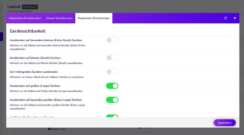
On small devices, sidebar-left modules are displayed just after the header (Cassiopeia does the opposite).
Sometimes it's not desirable, so is it a way (CSS ?) to force the left-hand modules to be displayed under the main content? (header-main content-sidebars modules)
Thanks for your advice!
Robert
Please Log in or Create an account to join the conversation.
- Administrator
- Offline
- Moderator
-

- Posts: 759
- Thank you received: 123
Replied by Administrator on topic [SOLVEd] How to display main content cell before sidebar-left on small devices?
Posted 2 years 7 months ago #33416
Hi Robert!
I had the same problem. My solution was a new template-style.
Ich changed the module-positions for mobile-view.
I had the same problem. My solution was a new template-style.
Ich changed the module-positions for mobile-view.
Supporter bei forum.joomla.de
Last Edit:2 years 7 months ago
by Administrator
Last edit: 2 years 7 months ago by Administrator.
The following user(s) said Thank You: RG-Consultant
Please Log in or Create an account to join the conversation.
- RG-Consultant
- Offline Topic Author
- Junior Boarder
-

- Posts: 28
- Thank you received: 0
Replied by RG-Consultant on topic [SOLVEd] How to display main content cell before sidebar-left on small devices?
Posted 2 years 7 months ago #33417
Thanks for you reply!
I know how to create a new style, but I don't know how to use it only with small devices.
Thanks for your help.
I know how to create a new style, but I don't know how to use it only with small devices.
Thanks for your help.
Please Log in or Create an account to join the conversation.
- Administrator
- Offline
- Moderator
-

- Posts: 759
- Thank you received: 123
Replied by Administrator on topic [SOLVEd] How to display main content cell before sidebar-left on small devices?
Posted 2 years 7 months ago #33420Supporter bei forum.joomla.de
The following user(s) said Thank You: RG-Consultant
Please Log in or Create an account to join the conversation.
- RG-Consultant
- Offline Topic Author
- Junior Boarder
-

- Posts: 28
- Thank you received: 0
Replied by RG-Consultant on topic [SOLVEd] How to display main content cell before sidebar-left on small devices?
Posted 2 years 7 months ago #33422
Thanks, I found it and will try.
Please Log in or Create an account to join the conversation.
Moderators: joomlaplates

